
As a mother of boys white or beige backgrounds have never really been a practical solution for my quilts. So I have gotten creative when it comes to choosing a quilt background. If you are looking to spice things up with your backgrounds. Here are a few ideas to go beyond beige.
Whether you want to make a bold statement or are look for a calm feeling choosing a background plays a big role. The main thing to keep in mind when choosing your background is that it contrasts with your block fabrics. It doesn’t need to be in your face different. But different enough that the hard work you put into creating your blocks doesn’t get lost in the background.
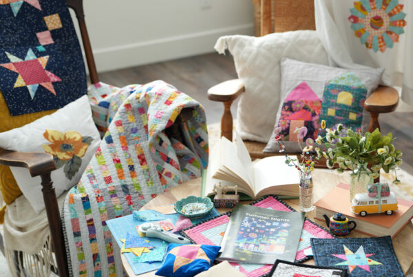
In Bear Scraps I used Bella solids honeydew for a soft calming background.

Where with Sunshine on a Cloudy Day I went bold with a variety of navy prints.
Even when I use a white or beige background I try to mix things up. I do this by choosing a print. With Fruition I used a cream with little leaves on it to go with the theme of the quilt. 
Or by using a bunch of low volume prints. Seven Sisters is an example of this. 
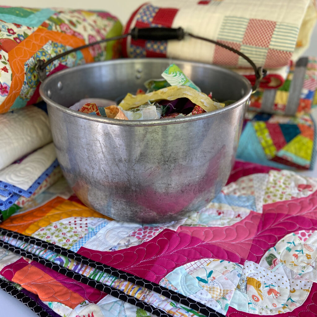
I like to clean out an overflowing scrap bin by using that color for a background. This crumb style method not only reduces scraps. It adds a lot of interest to your quilt. My blue and green bins where full when I created Wonky Rose Garden, found in my Crumb Quilts book.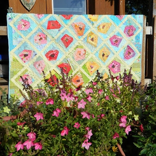
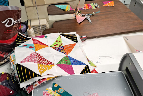
In the latest sew along quilt, Sew Abundant, I went with various medium to dark grays.
Check out this video to see more beyond beige backgrounds.


Okay, so I tried bdck666… it’s…different. Not totally my cup of tea, but some folks might dig it. Give it a shot if you’re feeling adventurous: bdck666
References:
Wild rose casino emmetsburg https://bridgedesign.site/
References:
No deposit bonuses https://sibze.ru
References:
Casino new york telegra.ph
References:
Blackjack com annunciogratis.net
References:
Quad casino forum-joyingauto.com
References:
Alabama casinos https://truckwiki.site/
References:
Riverbelle casino undrtone.com
References:
Casinobonus2 com https://crowder-peters.hubstack.net/ice-casino-1-500-bonus-200-freispiele-lizenziert
References:
Santa fe casino las vegas molchanovonews.ru
References:
Online slots games https://lovebookmark.win/story.php?title=hit-n-spin-bonus-ohne-einzahlung-50-freispiele-auf-big-bass
References:
Drive casino cosmo-casino-download.online-spielhallen.de
References:
Book of ra online spielen casino paysafecard sofort