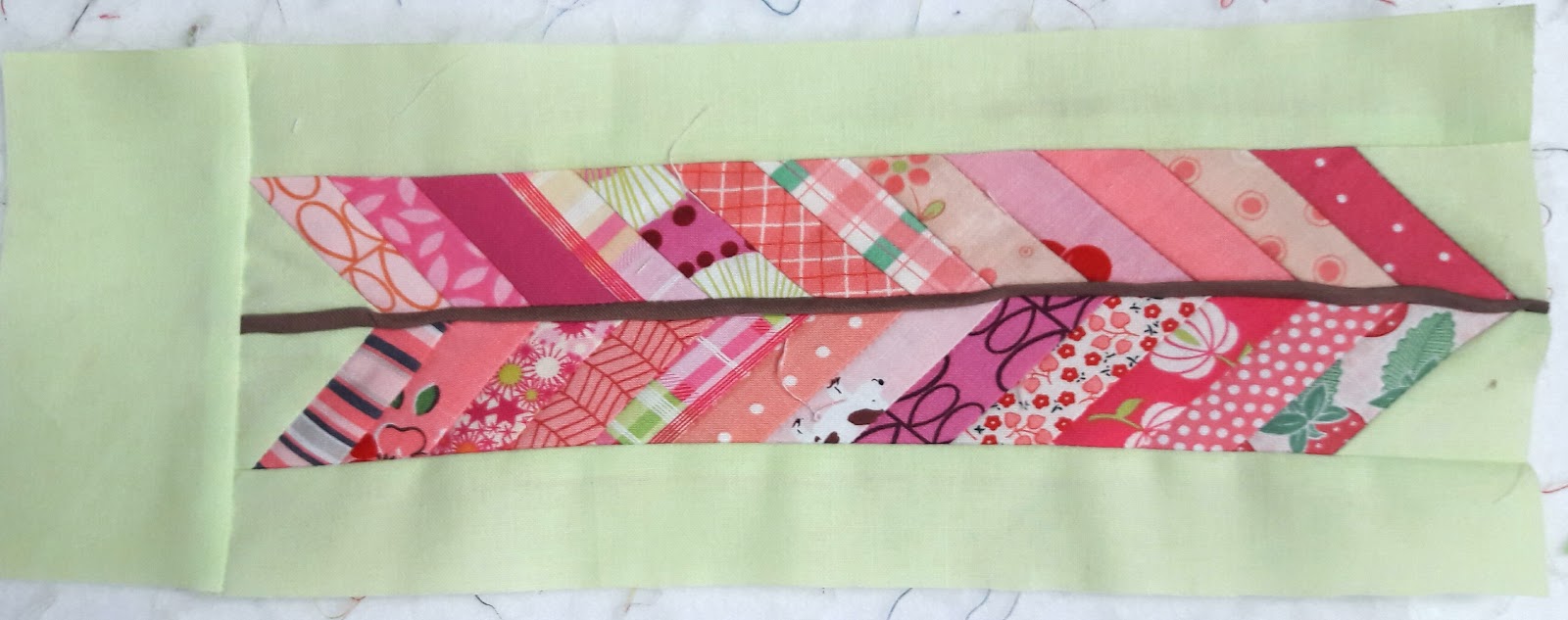
I’ve been auditioning various version of my feather blocks. First I tried a three dimensional spine. It took way to much work to get the spine to look good. I didn’t like it enough to invest that much time on each block.

So next I tried a thin strip for the spine. I liked it better but was not thrilled with the blunt brown top at the end of my feather.

Finally I added a small diagonal pink tip. I liked this better. Sorry it’s a little hard to see in the picture.

Every fall I transplant a few herbs into pots I got from my grandparents house when we sold it. I remember grandpa always had lots of house plants in his window and these cute pots are a fond reminder of him. Sadly while I was away teaching at Bryce this last winter, my family forgot to water my thyme. I’ve been without it ever since. Bummer!

Thankfully the plant I cut it from has come back with the warm spring weather. Looking forward to being able to cook with fresh thyme again.

My lavender is also starting to bloom. Oh how I love the scent of fresh lavender. Looking forward to fresh cuttings. With herbs on the mind and the recent demise of my aloe plant. (Somehow the roots died) I harvest the gel and made this all natural Aloe and Herb Soap. It is colored with cut herbs and clay, and scented with an essential oil blend of herbs. It is fresh smelling and skin loving. Find it in my Etsy shop.

I love those feathers.
So glad that your plants made it through the winter. We use our fresh thyme on so many things we cook.
I'll bet the soap smells heavenly too.
Do you like your feather blocks now?
I lost some lavender this season, we went from cold to hot then cold to hot and it killed off some of the plant.
Can you find a way to cut off the spine (at a slant) a little way down from the top, and just have the last few pink strips meet in the middle with no spine? Or make a spine that's tapered, and very thin at the end?