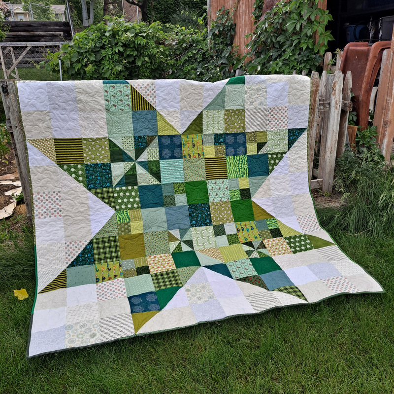
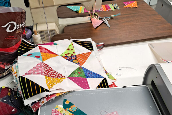
When choosing fabric for your quilts two things to consider are color and value. Most people think that color is the big player. But truth be told the right use of value is what makes your quilt shine. Take my newest Jumbo Scrappy Star.

The leaf, flying geese and pinwheels show up because of the contrast in value between the design elements and the background. While the four patches blend in and are more discreet. There values are closer to the same. You can see this more clearly when you take a picture of the quilt in grayscale.

Doing this will takes the guess work out of the value of a particular fabric. Sometimes it’s hard to tell if a particular fabric reads light, medium or dark. Putting your camera on grayscale makes this easy. So once you’ve pulled fabric. Check to make sure you have a good range of lights to darks. Then again when you have your quilt laid out. Check to make sure the elements you are wanting to stand out are popping.
You can learn about this concept in my Jumbo Scrappy Star workshop going on right now. But will only be available through the end of the month. In Discovering Hidden Quilts we go deeper with more examples of how color and value play a role in creating your quilts. Enrollment is open now through Oct. 14th. So if you’re ready to turn your scraps and stash into beautiful quilts. We’d love to have you join us. Get more details and join the fun.


Thanks for sharing. I read many of your blog posts, cool, your blog is very good.
Thanks for sharing. I read many of your blog posts, cool, your blog is very good.
I don’t think the title of your article matches the content lol. Just kidding, mainly because I had some doubts after reading the article. https://www.binance.com/cs/register?ref=OMM3XK51
I don’t think the title of your article matches the content lol. Just kidding, mainly because I had some doubts after reading the article. https://accounts.binance.bh/register/person?ref=GGYHGRE