Knowing how to use contrast and value in your quilt enables you to draw attention where you want it. Allowing you to accentuate your strengths and downplay your weaknesses. How is this possible? Let me explain.
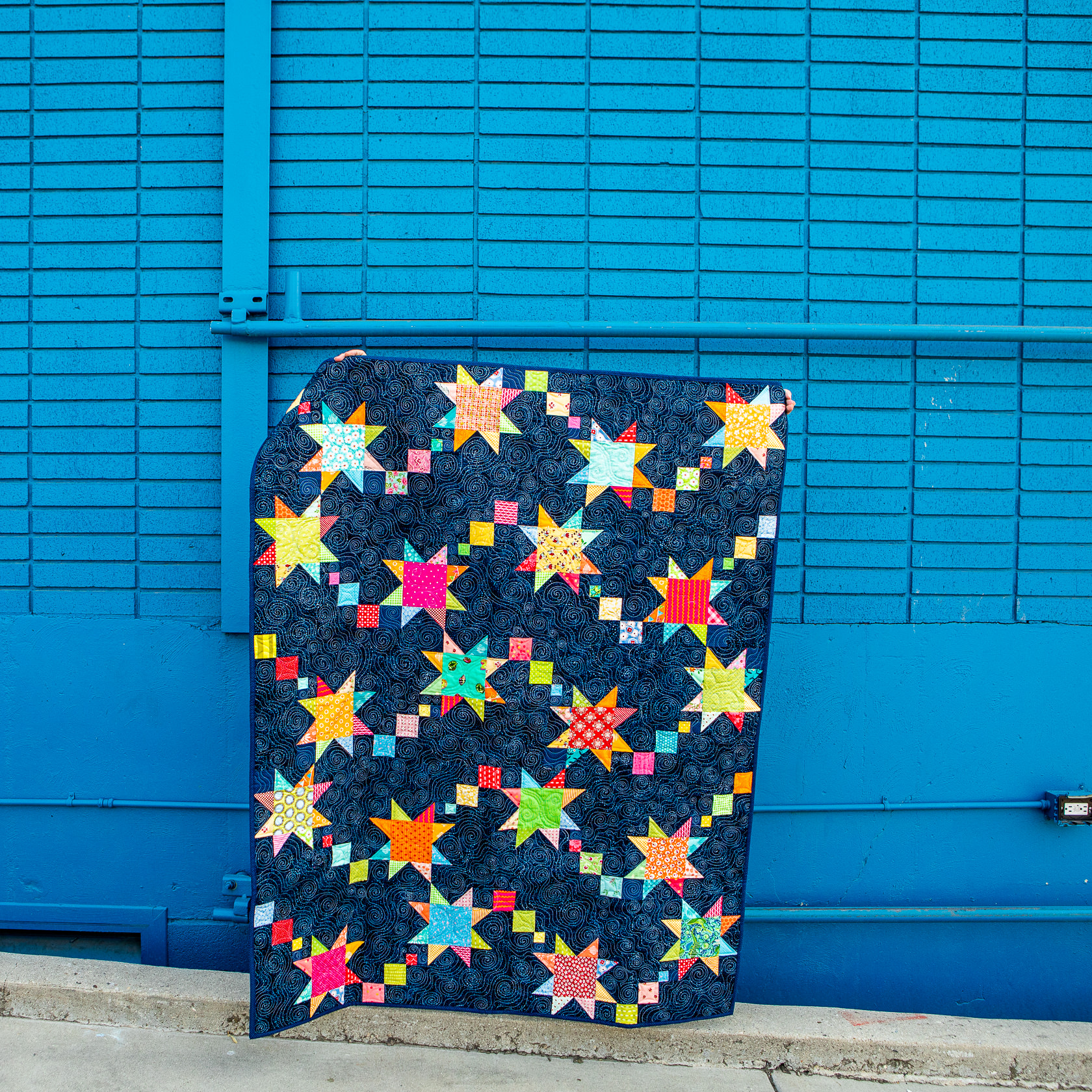
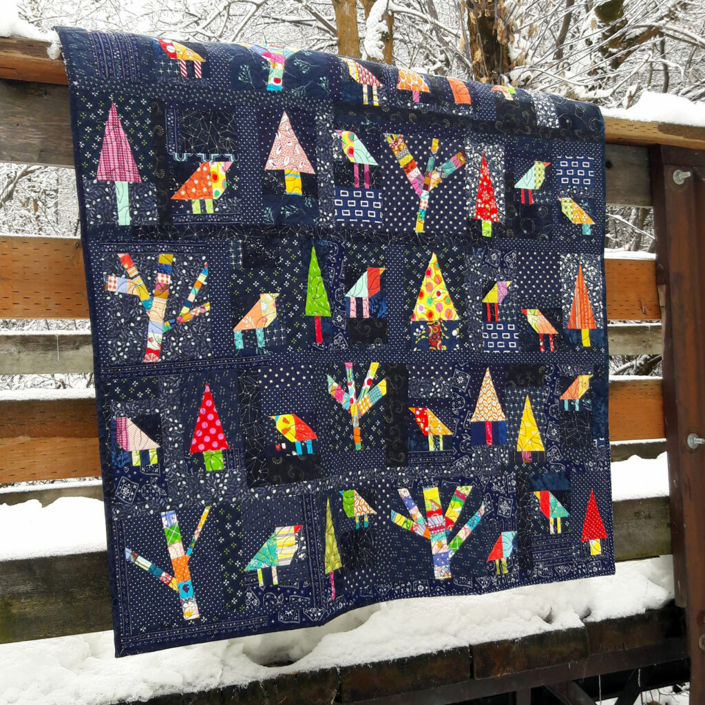
Value has to do with the lightness or darkness of a color or fabric. How you combine the value of fabrics effects how they play off of each other. If you want an area of your quilt to stand out. Then make sure there is a high contrast between the lightness and darkness of the fabrics in this area. Enchanted Forest is an example of this. The medium and light colored trees and birds have a high contrast with the navy background. Allowing them to pop and stand out.
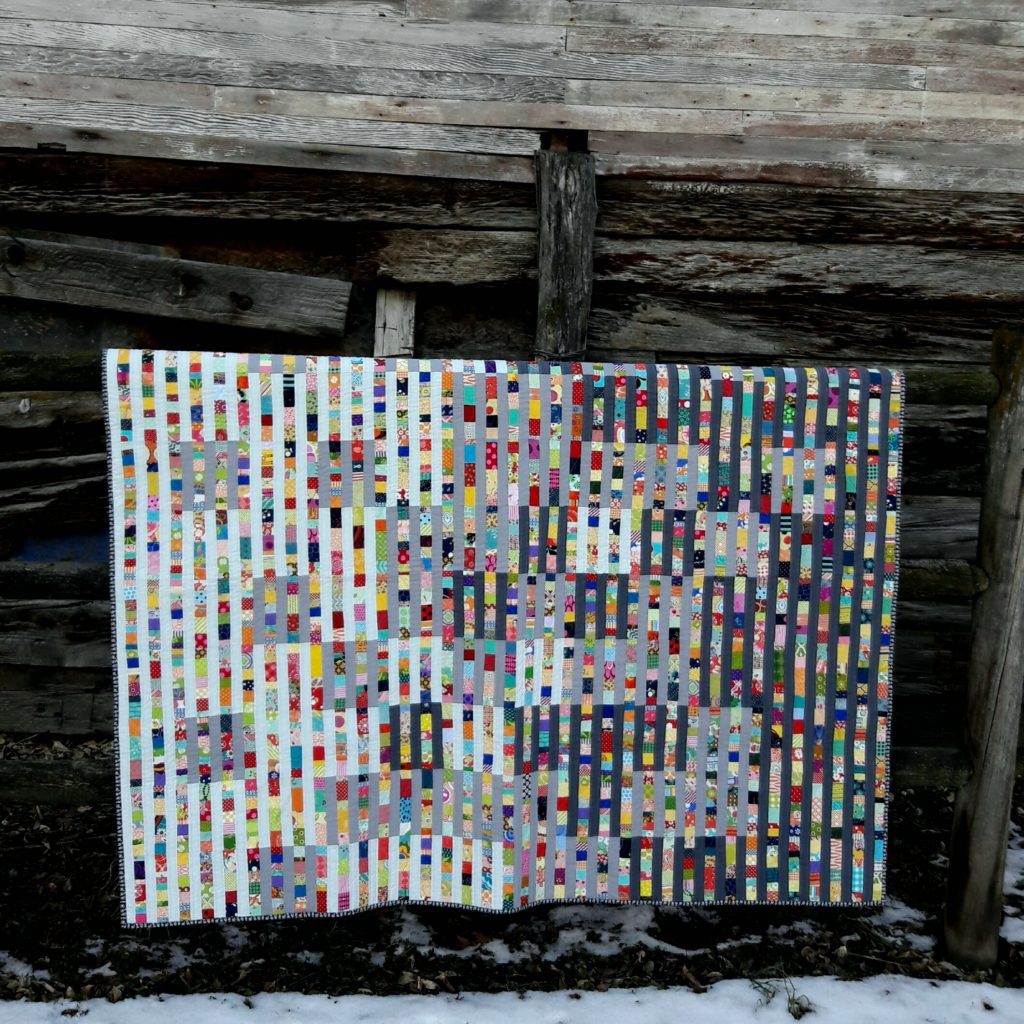
If you are looking to make things blend and have a less prominent role in your quilt. Try using fabric that are similar in value. Funfetti is one example of how this works. As is 3 Red Hot Kisses, the x and + blocks blend together and are hard to distinguish. While allowing the 3 red kisses to stand out. Finally Gradation gradually blends from light to dark.
Want to learn more about how value plays a role in your fabric choices and quilt design. Join me for my FREE workshop, 3 STRATEGIES TO SUCCESSFULLY CHOOSE FABRIC FOR YOUR QUILTS. We will explore color, value. Plus learn one simple trick to ensure a perfect fabric pull.