There is a world of color out there. Sometimes it can seem overwhelming when it comes to choosing how you will combine color into a cohesive quilt. Let’s take some of that mystery out of choosing colors for your next quilt.

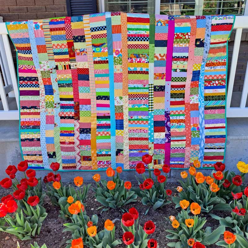
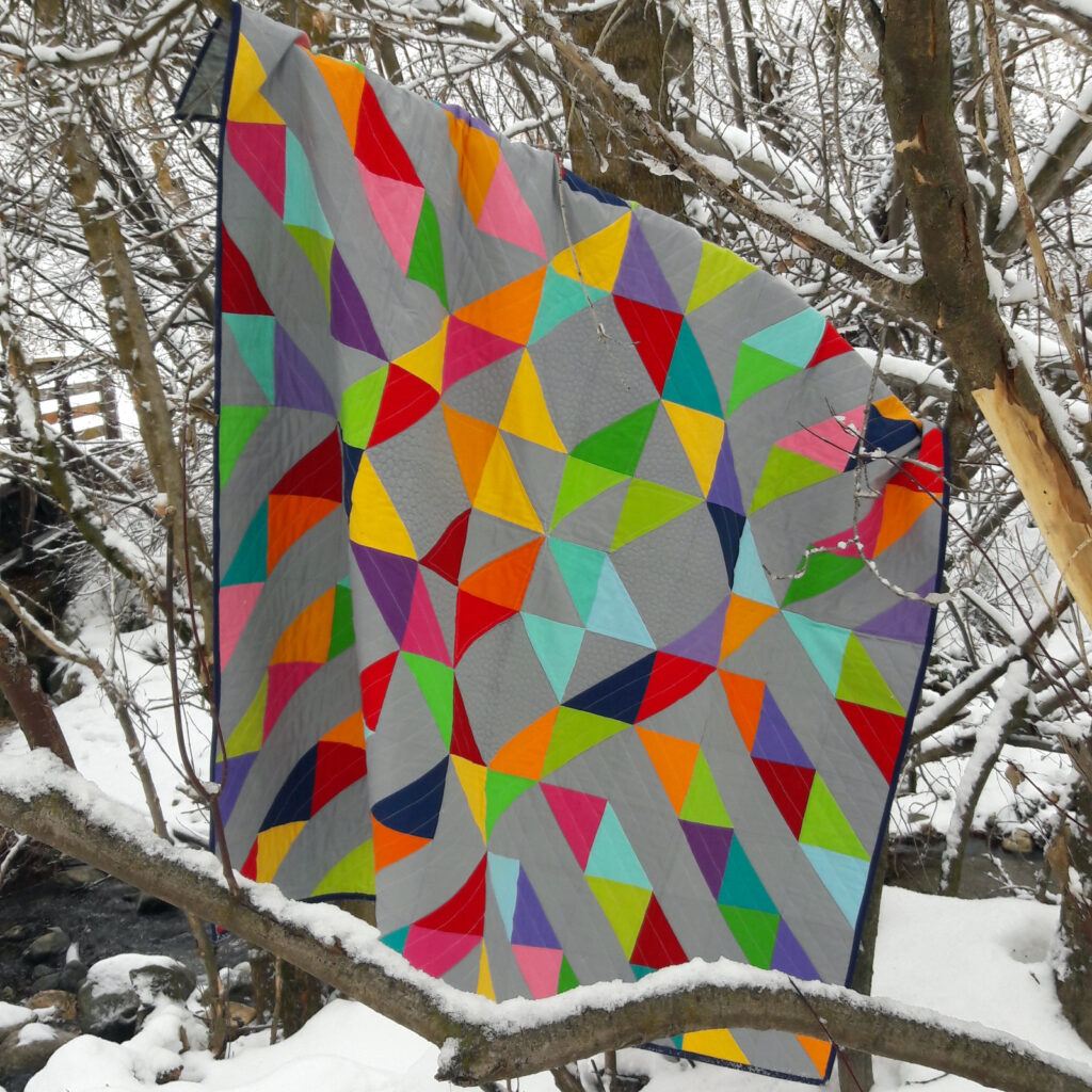
First try drawing on the color wheel. You can use primary colors, secondary colors or color wheel opposites. I like to combine primary and secondary colors for a colorful crayon box look. I based Sunshine on a Cloudy day of a box of 24 crayons. After all who doesn’t love a new box of crayons? So pretty! Plus the possibilities are endless.
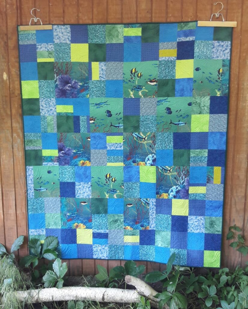
Next try using color families. There are warm colors or cool colors. You can combine reds, pinks and purples link in butterfly kisses. Or try just two colors like I did in this under the sea quilt. Because these color families share similar elements in their make up they go together play nice together. Taking the guess work out of knowing if they will look good together.
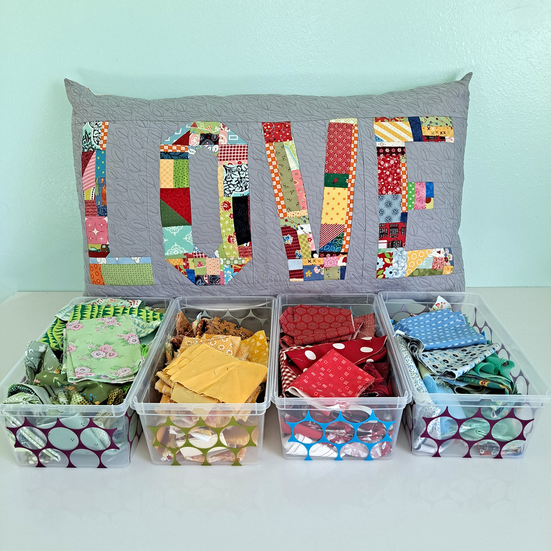
Another way to combine color is by choosing a theme. Try Halloween with oranges, greens, blacks and purple. Or maybe you want to think spring with pastels. In Crazy Love I went with a Valentine color theme.

Get more tips for color and fabric selection in my upcoming FREE workshop; 3 STRATEGIES TO SUCCESSFULLY CHOOSE FABRIC FOR YOUR NEXT QUILT.